Alerts display brief and important messages that capture the user’s attention but don’t interrupt their workflow.
Usage
When to use
- To display a concise, important message that requires the user’s attention.
When not to use
- To communicate successful feedback on a user’s action, consider Toast.
- As a dialog to confirm an action, consider Modal.
- To flag new features (e.g., "In Preview", "Beta", "New", etc), consider Badge.
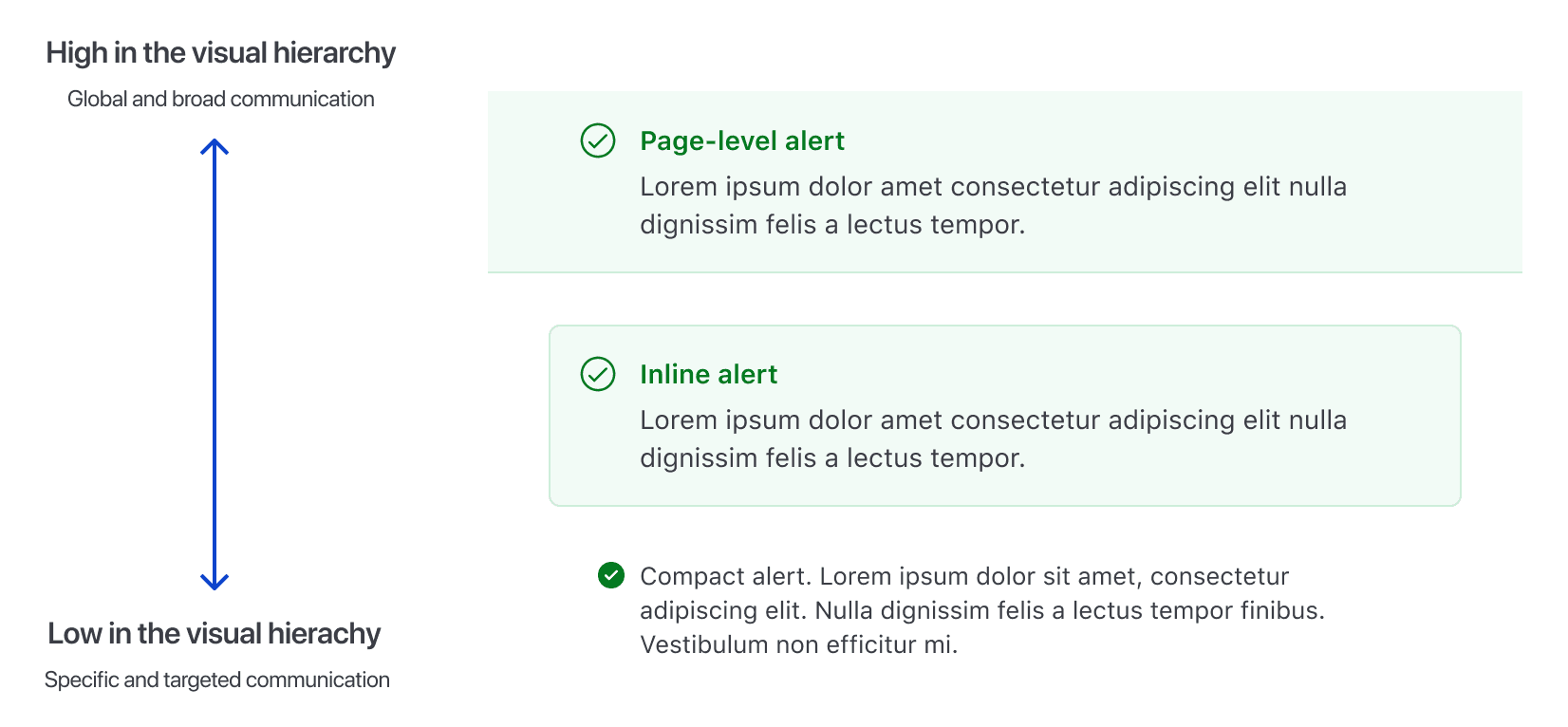
Types of alerts
There are three types of alerts: page, inline, and compact.
Page
Use page-level alerts on the top of the page, between the navigation and the breadcrumb to inform users of an event that may require the user’s attention or action.
Inline
Use inline alerts when the message is contextual or specific to the section it’s placed in.
Compact
Use compact alerts when a less prominent alert is needed.
Ordering Alerts by type
Alert types have an implied hierarchy and should be ordered starting from page and descending in hierarchy to compact.
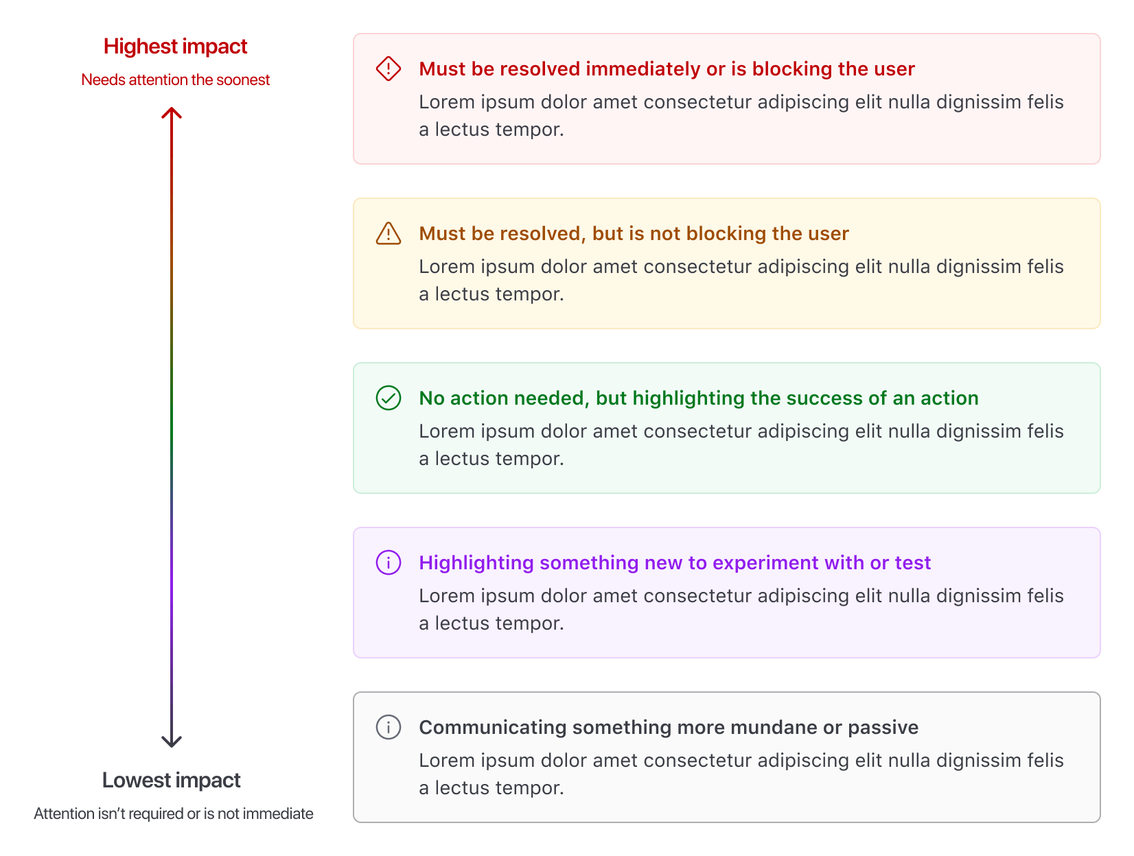
Color
Informational alerts
Informational alerts are non-urgent, non-disruptive alerts that don’t require immediate attention and will not notify users with assistive technology.
Neutral alerts
Use neutral alerts to show general information regarding the current context or relevant actions.
Highlight alerts
Use highlight alerts to show more prominent general information or promotional content.
Status alerts
Status alerts, such as success, warning, and critical, will immediately notify users with assistive technology.
Success alerts
Use success alerts to indicate a successful action. Use it sparingly. To communicate success after a user action is performed, use Toast.
Warning alerts
Use warning alerts to help users avoid an issue. Provide guidance and actions, if possible.
Critical alerts
Use critical alerts to indicate critical errors, such as validation errors, that require user attention or action.
Use the Alert for more intrusive message communication about errors or critical disruptions at an application, page, or section level where users need to take immediate action.
Use the Alert to communicate validation errors. For more details, refer to the form validation patterns.
Don't use alerts to provide non-intrusive feedback to users about the failure of an ongoing task or request. For example, a failure while deleting a cluster. Use the Toast instead.
Don't use alerts to communicate error messages that are not caused by the user. For example, an unsuccessful Vault cluster creation due to a failure while validating the deployment. Use the Toast instead.
Ordering Alerts by color
Order multiple Alerts by their importance and impact on the user, starting from critical, to communicate an Alert that must be resolved immediately, and descending in order of perceived impact to neutral.
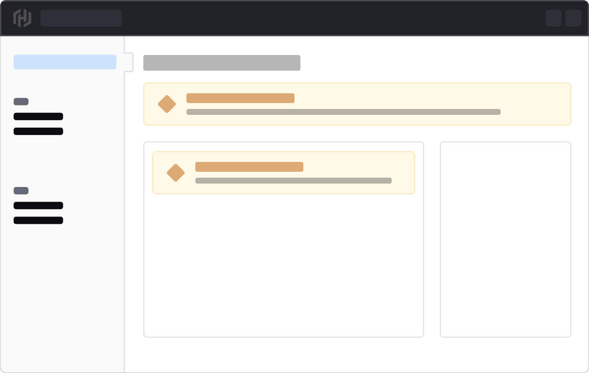
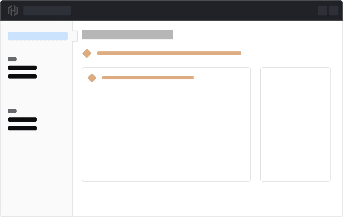
Placing Alerts
Inline and compact Alerts can have more meaning if they are placed within the element that is responsible for the Alert. This can help when it’s necessary to have more than one Alert on the page and is relevant for pages that aggregate content like dashboards, or where a specific message is necessary.
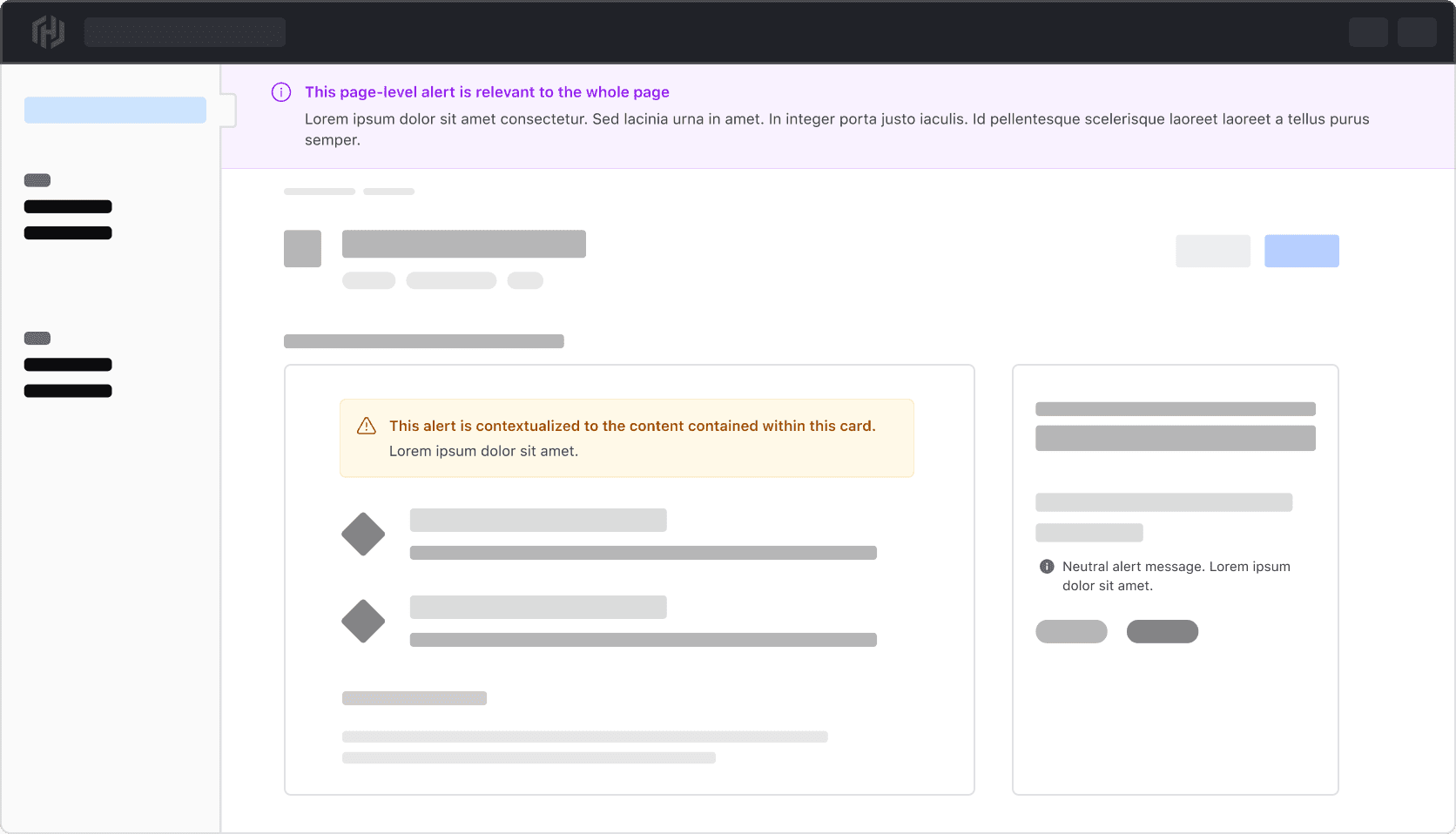
Placement by type
Where an Alert is placed is dependent on the type.
Page
Page alerts are placed between the global header navigation and the breadcrumb, next to the left navigation.
Inline
Inline alerts can be added to a section or component or inline with content.
Compact
Compact alerts can be added to a section or component or inline with content.
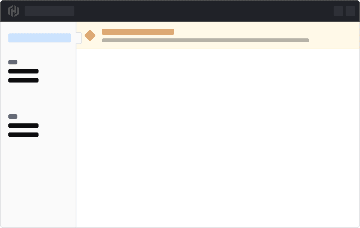
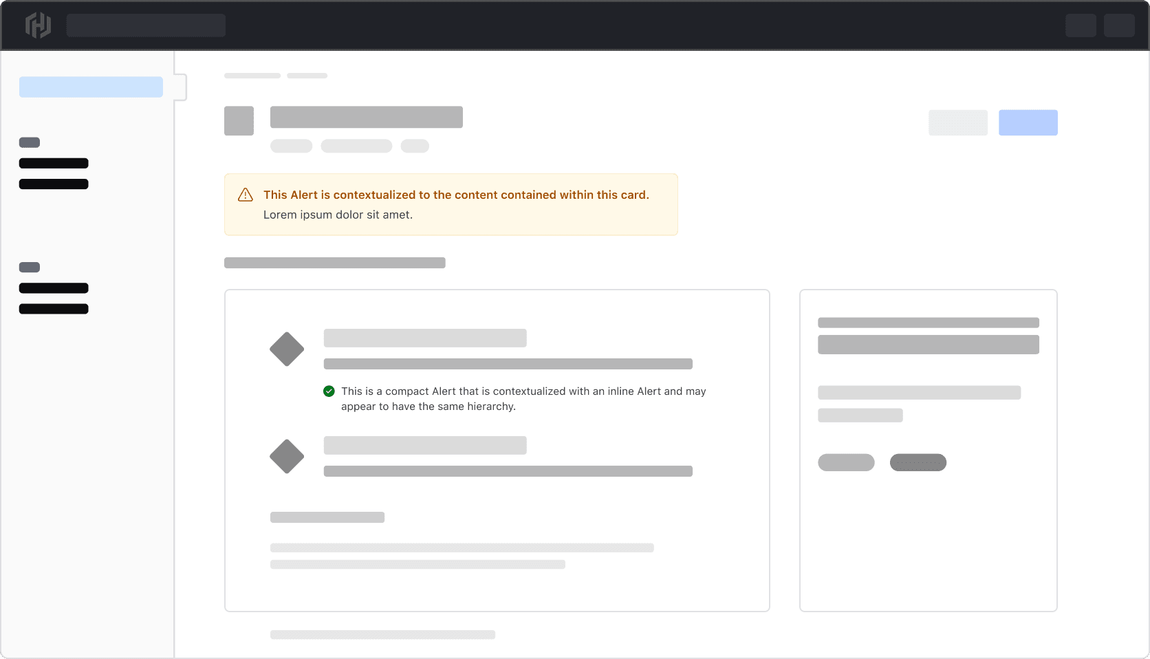
Mixing Alert types
We recommend against mixing different types of Alerts in the same context, as this can unintentionally convey that different Alert types have the same hierarchical impact.
Don’t mix different Alert types in the same context.
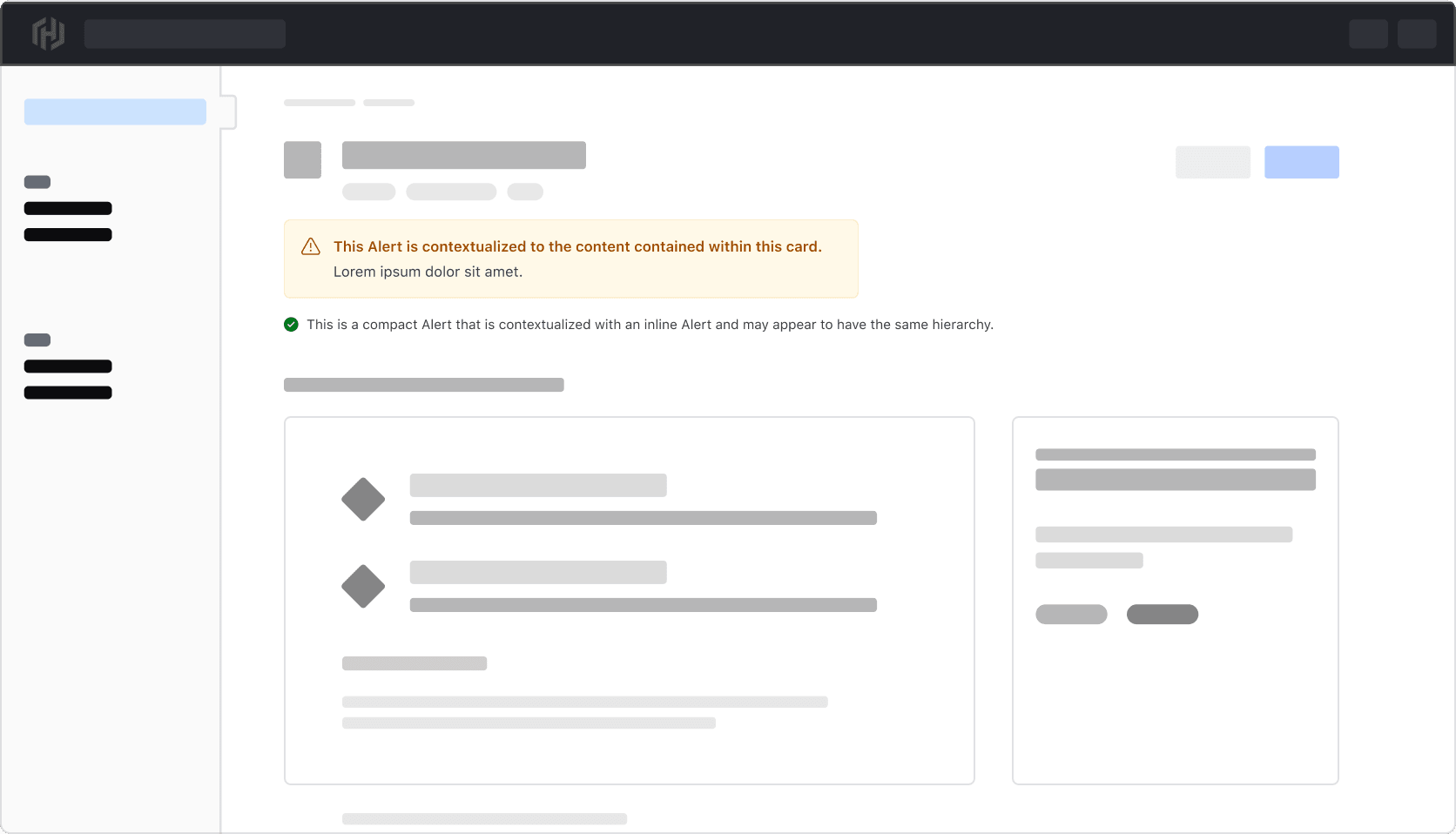
Instead, be more specific with how the Alerts are placed depending on what the message applies to.
Icons
All alerts have icons by default that are intentionally tied to the alert type.
Icons within the neutral and highlight alerts can be replaced with other icons. Change them only when the new icon provides the user with extra value; otherwise, use the default icon provided.